Redefining the retail in-store experience
My Role in the Point-of-Sale Redesign
Redefining the in-store experience required extensive research, strategic planning, and cross-functional collaboration. The success of a customer's visit—whether they found the right size, received adequate assistance, or encountered a long checkout line—directly influenced their decision to complete a purchase. My role in this initiative was to help shape the UX, UI, and visual design of a mobile checkout experience on an iPad device, ensuring a seamless and efficient purchasing process.
Key Contributions:
User Research & Insights – Studied research materials, including an in-depth journey map of store associates and personas developed by Gap, Inc.'s Consumer Insights and UX teams.
Experience Design – Focused on enhancing in-store customer interactions by optimizing mobile checkout for store associates.
Collaboration & Cross-Device Strategy – Worked alongside a fellow UX/visual designer who concurrently designed the experience for iPhone/iPod devices, ensuring a cohesive design across platforms.
Planning for Implementation – Contributed to a design solution that was scheduled for development and rollout by Fall 2016 or early 2017.
By integrating research-driven insights with intuitive design, the mobile checkout solution aimed to improve the in-store purchasing journey for both customers and associates.
PROJECT SCOPE
UX/ UI Design
Visual Design
Prototype
Mobile Tablet
COLLABORATORS
Director of UX Design
Senior UX Designer
GapTech Engineering Team
Consumer Insights Team
OVERVIEW
Elevating the retail experience through technology
The rise of omnichannel retail has highlighted opportunities for Gap Inc. to enhance both associate and customer experiences through technology. One key challenge was replacing outdated point-of-sale (POS) systems, which hindered a seamless shopping experience. However, the high cost of upgrading these legacy systems posed a significant barrier for retailers. To bridge this gap, Gap Inc. aimed to leverage Apple iOS devices to develop a responsive, mobile POS app. This solution sought to streamline in-store transactions, improve efficiency, and foster stronger interactions between customers and store associates.
USERS & AUDIENCE
Understanding Store Associates
To support the in-store team’s efforts in redesigning key retail experiences, personas were developed to represent different types of store associates. These personas were crafted based on insights gathered from stakeholder journey mapping and research, helping to align design decisions with the real-world needs and behaviors of store employees. By modeling these personas, the team ensured that the new solutions would effectively enhance both the associate and customer experience.
PROCESS
Integrating iOS
One of the key in-store challenges was leveraging modern technology to bridge the gap between the customer and store associate experience. To move beyond the limitations of traditional counter-based interactions, Apple iOS devices were integrated to foster a more seamless and dynamic in-store experience. Transitioning legacy POS systems to mobile devices presented several challenges, including:
Checkout – Streamlining the purchasing process
Stock & Price Checks – Providing real-time inventory and pricing information
Returns & Exchanges – Simplifying the post-purchase experience
Gift Cards – Enabling digital and physical gift card transactions
Inventory Management – Enhancing stock tracking and replenishment
Ship from Store (SFS) – Allowing fulfillment from in-store inventory
Reserve in Store (RiS) – Letting customers hold items for in-store pickup
This transformation aimed to empower store associates with greater flexibility and efficiency, ultimately improving both customer satisfaction and business operations.
PROCESS
Split Payment (Gift Card / Credit Card
PROCESS
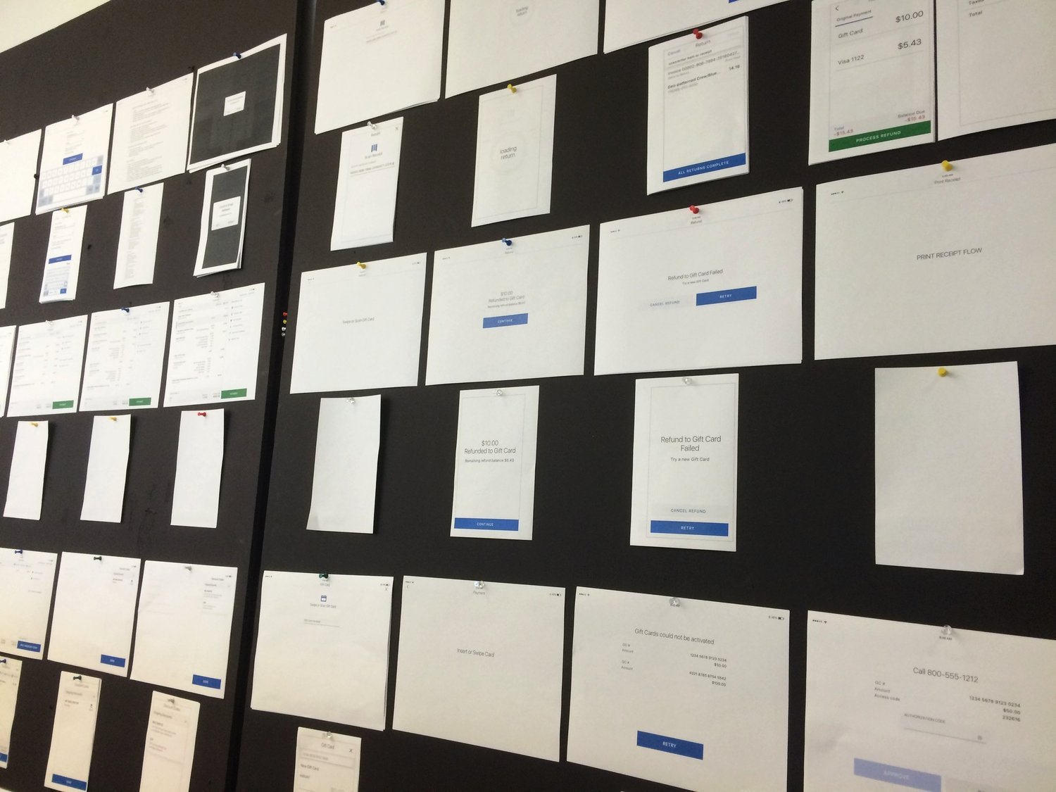
Collaborative Critique
The success of the iPad (larger breakpoint) design was shaped through multiple iterations and design critiques. To maintain cohesion and alignment with the smaller iPod version, my team and I actively participated in daily stand-ups and frequent design reviews with both peers and directors. These critiques provided valuable feedback and direction, ensuring consistency across all experiences. By refining our designs through this collaborative process, we achieved a unified look and feel before handing them off to the GapTech development team for implementation.
OUTCOMES & RESULTS
Quick, Efficient & Learnable
The finalized design, while simple, went through multiple iterations and design reviews to refine the user experience, interface, and visual design. Its efficiency and ease of use stem from a mobile-first approach, ensuring that only the most essential features were prioritized—starting with the iPod Touch version.
To enhance clarity and usability, I collaborated with a Gap, Inc. staff copywriter to craft concise, effective language for the app’s flow. The iPad version builds upon this foundation with a spacious layout, a clear visual hierarchy, and intuitive navigation. Thoughtful use of typography, subtle color accents, and well-proportioned components enhances readability and usability. The final design enables users to quickly learn the interface, focus on key content, and easily identify calls to action, creating a seamless and efficient in-store experience.


